In this series of blog posts, from the perspective of an institutional yield farming fund, we argue that DeFi should be represented as a knowledge graph to properly assess the risk of the available opportunities. Moreover, we compare this approach with similar work performed in other domains such as cybersecurity. We cover the various uses of such a graph: risk scoring, book correlation, hack contagion, and identifying points of failure.
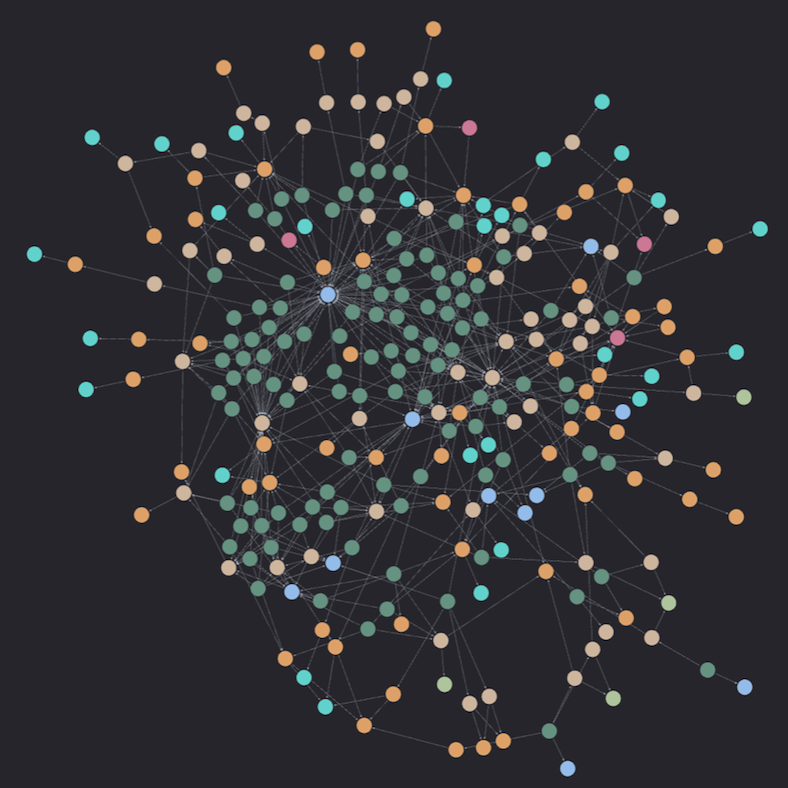
Introducing Nebula : A graph based representation of DeFi
Glossary
DeFi vocabulary is assumed to be known by the reader.
- Knowledge graph: Structured representation of interconnected data stored as a graph.
- NEO4J : Leading graph database management system.
- Cypher : Querying language for NEO4J, designed for graph data manipulation.
Introduction
For better or worse, for the foreseeable future, the financial use-case is crypto’s killer app. Outside of speculation and decentralized capital formation, the financial use-case is dominated by DeFi. In the realm of DeFi, the concept of "being finance legos" underscores the emergence of intricate structures characterized by numerous interdependencies. These complexities pose significant challenges when assessing risks and understanding protocol dependencies, particularly in interactions with "high-level pools."
Consider the two-sided Aerodrome USDC/eUSD liquidity pool. This pool consists of USDC, along with eUSD, a stablecoin issued by the Reserve Protocol and collateralized by cUSDC, cUSDT, saUSDC, and saUSDT. These underlying assets are interest-bearing tokens issued by Compound and Aave. Additionally, it's important to note that Aerodrome itself is a Fork of VelodromeV2, adding another layer of complexity to the risk assessment. Furthermore, the engagement of oracles used by Aave and Compound introduces additional intricacies.
Decomposing these dependencies demands a profound understanding of DeFi. Failure to account for them can lead to oversights in due diligence processes, potentially exposing capital to unforeseen risks.
In summary, navigating the complexities of DeFi requires a comprehensive grasp of protocol dependencies and a meticulous approach to due diligence. By understanding these interconnections, participants can better assess and mitigate risks in the ever-evolving landscape of DeFi.
DeFi as a graph
To alleviate the aforementioned concerns and streamline the process of due diligence and risk scoring, we propose the introduction of the DeFi Graph, which models dependencies within the DeFi ecosystem.
Opting for a knowledge graph structure instead of tables and join operations is primarily motivated by the uncertainty surrounding the length of dependency paths.
For instance, let's imagine a scenario where a hack occurs on Silo. Now, suppose one needs to check whether a specific Magpie pool could be affected by this hack. Answering such a question would be challenging with a table-oriented database as we would not know how many joins to perform to connect entities. However, it simplifies into a straightforward graph exploration problem when utilizing a knowledge graph structure.
Let us first go through the construction of such a knowledge graph. Then, multiple querying examples will be covered to access the power of that representation.
Graph construction
As mentioned in the introduction, we consider the graph representation problem from the perspective of an institutional yield fund providing liquidity to various DeFi pools, which is Dialectic’s core focus. Thus, we center the graph around liquidity pools. In that knowledge graph, we represent the following nodes and edges to respectively document DeFi entities and relationships linking them :

Note that all these relationships are directed.
It translates into the following schema:
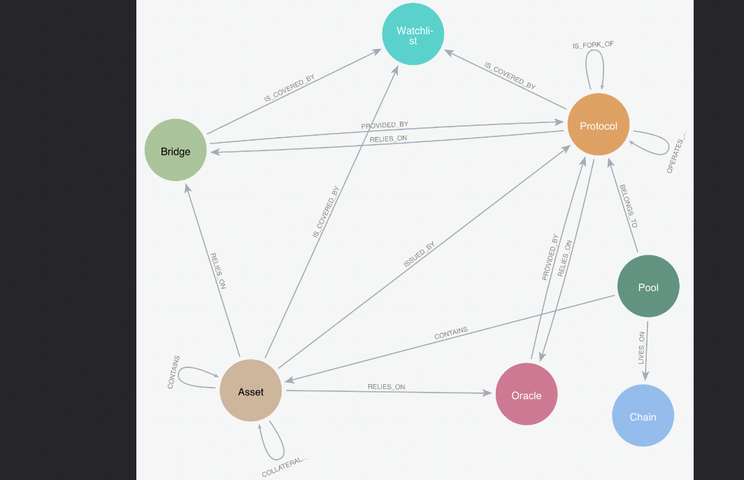
This graph is built automatically using on chain data and NEO4J graph database. NEO4J also allows us to easily introduce new edges to document our crypto native teams knowledge about DeFi. It is important to note that the graph has been specifically generated to cater to the requirements of a yield farming fund focused on stable and ETH-related pools.
Results and implications
The graph is populated based on our internal pool database consisting exclusively of Stablecoins (ex: DAI/USDT), and ETH/LST (ex: WETH/rETH) pools. We obtained a total of 5336 nodes and 14626 edges, detailed below:

The node distribution is primarily dominated by pools, which connect to the rest of the graph through relationships such as CONTAINS, LIVES_ON, and BELONGS_TO. This dominance extends to the edge distribution as well. The prevalence of pool nodes compared to others arises from the presence of multiple pools belonging to the same protocol, residing on the same chain, and containing the same assets.

Now that the graph structure has been properly introduced, one may wonder the identification of the most central nodes within this configuration. To address this query, we define the centrality of a node as the number of pools with a directed path connecting to it. In practice, we run the following formula.

The following distribution is obtained :
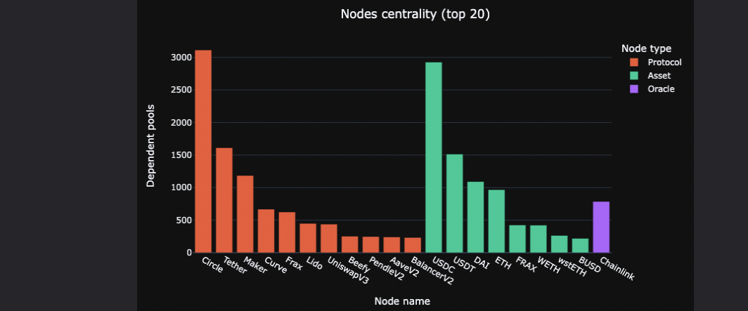

As anticipated, we notice that Circle Tether and Maker hold significant influence within the graph, leveraging their respective assets USDC, USDT, and DAI. Additionally, it appears that many pools rely on the Chainlink oracle.
Querying the graph
Now that the graph has been designed, we embark on various querying applications to showcase the effectiveness of this design.
Pool dependencies
The pool-centric nature of the graph allows us the find all the dependencies of a given pool by simply walking down the graph, starting from the pool. In practice we execute the following Cypher query, where “pool1” refers to our internal pool identifier :


In the case of the Aerodrome USDC/eUSD we obtain the following result:
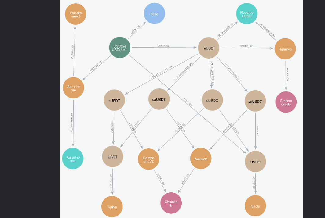


The exploration algorithm initially pinpointed the desired pool and traced paths with edges extending away from the original nodes. This methodology enabled us to break down the tokens within the pool and ascertain their respective issuers. In the case of eUSD, the algorithm also dissected the assets utilized as collateral by the reserve protocol. Furthermore, we identified inter-protocol dependencies, noting Aerodrome as a fork of VelodromeV2. Finally, we flag additional nodes as watchlists, facilitating the monitoring of the protocols.
Hacks contagion
Based on the graph structure , one can now easily reason on hack contagion. Let us take the following example: A hack happens on Curve.
In a single query we can run a BFS staring from the protocol node representing Curve and return all the touched pool , node that we only follow edges directed toward the failing node.

Running the above query and obtain the following graph:
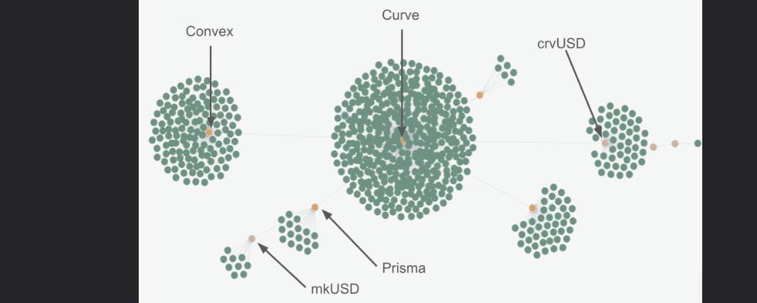

We first observe a central set of nodes representing Curve itself and all the proprietary pools. One relationship further, we see the protocols Conic, Prisma, and Convex, along with their pools. Additionally, we distinguish the crvUSD asset and pools from other protocols that depend on it.
On that graph one could rank the pools according to their distance to the central Curve not and take reallocation decision based on the results.
N-Order exposures
Understanding the n-order exposures of a yielding book is a complex task, particularly in the management of portfolios comprising numerous strategies. Adopting a superficial "flat" view may lead one to perceive exposures solely to Convex, StakeDAO, and Aura, mistakenly assuming diversification is attained. However, a deeper examination reveals that these protocols all depends on Curve.
Fortunately, such a problem is easily solvable using the DeFi graph. For example, the following function returns the total exposures per protocol, where the allocated_usd property of a pool node represents the capital invested in the corresponding pool.

Following the same logic, one could identify potential points of failure in the portfolio composition. A high dependency on a single bridge could pose a significant risk to the book.
For example, to identify the invested capital exposed to the Wormhole bridge, one can execute the following:

Conclusion
We crafted a graph representation of DeFi and showcased the efficacy of this data format within the realm of a pool’s risk assessment. We delved into the design choices, covering various use cases such as pool dependencies decomposition, n-order exposure unfolding, hacks contagion... We have illustrated that the graph significantly simplifies addressing these issues.
In a forthcoming blog post, we will contrast the designed graph with attack graphs from the cybersecurity domain and introduce a quantitative method to leverage the graph for risk measurement purposes.